I wrote about 59Fifty baseball caps a few months ago, and am still somewhat intrigued by the whole concept. Even though I'm not a huge baseball fan, I always like to root for the underdog. Accordingly, I recently acquired an official on-field cap bearing the logo of one of the suckiest teams in baseball: the San Diego Padres.

Technically, this piece of headwear should be called the New Era 59Fifty Official MLB On-Field Cap, San Diego Padres, Alternate Color (or something to that effect). The above picture shows the sticker flair that adorns the brand-new cap. I'm an old traditionalist, so I immediately removed all the stickers from the cap. I realize that some may consider this to be sacrilegious, but meh whatever. It's just a hat.

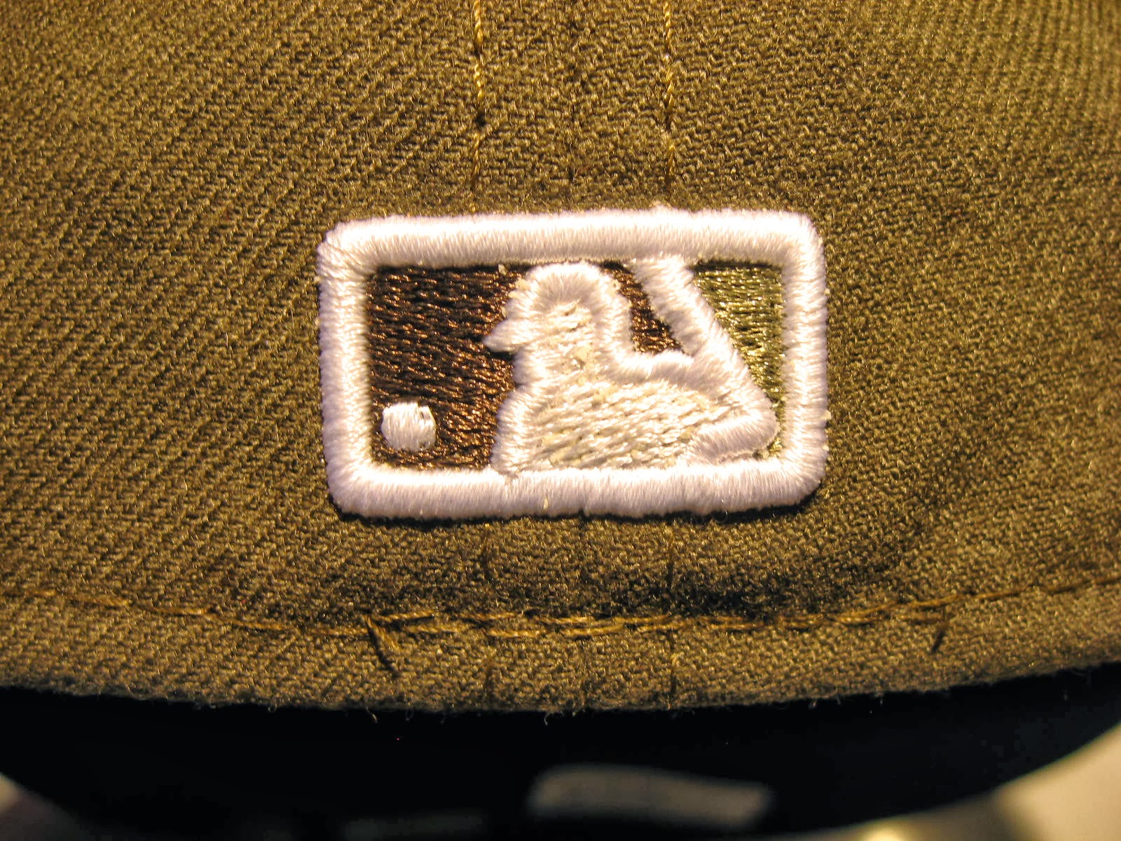
Yes, it's just a hat, but it's an OFFICIAL hat. It says so on the inner headband part. That makes it special, I guess. I like the fact that the hat isn't cluttered with New Era branding or other extraneous logos. It has the San Diego emblem on the front and the obligatory MLB "batter man" logo on the back - that logo has been around since the late 1960s (not kidding).
I like the olive color and overall look of this cap. Unfortunately, the crown doesn't fit my pin head as well as it should. I may need to hit the New Era online forums to see how best to shrink the crown a bit. LOL, there's an online forum for everything in the world these days. So awesome.
tuck it.
ReplyDelete