March 30, 2013

Fountain Pen Purchase: Real-Time Thoughts, Part 2

Part 1 of this tale can be found here. Basically, I'm trying to pick one of the following to be my next fountain pen (even though I don't really need another one): Sailor Professional Gear Imperial Black; Sailor Professional Gear Matte Black; Edison Pearl; or an "inexpensive" Nakaya.

I've already read a bunch of online reviews, looked over the Sailor, Edison, and Nakaya websites, and reviewed a number of online forum posts related to my candidate pens. I've even reached out and asked for expert cyber-advice in an attempt to help me choose a pen. There seems to be very good agreement about the quality and excellence of Japanese nibs made by companies such as Sailor and Nakaya (nib quality is really important to me, because I'm more interested in the actual writing experience than looks, design, materials, and filling mechanisms). In fact, Sailor nibs are very highly regarded and some people say that they are among the best in the world. Edison sources its nibs from a German supplier (at least that's what my internet research tells me), and those nibs are also highly regarded. That said, it seems as though most people favor Sailor nibs over Edison nibs. Moreover, I already have two German fountain pens: a Lamy Vista and a Pelikan M205; and I'm not too eager to try yet another German nib. By the way, the Lamy has an acceptable nib, and the Pelikan has a super smooth nib that I feel is excellent.

So . . . using nib performance and reputation as important deciding factors, I've taken the Edison Pearl off of my wish list for the time being. Don't get me wrong, the Pearl still looks really good to me, and it would be great to have a custom pen that is handmade in the United States. I just have a gut feeling that I should go with a traditional Japanese company that fabricates its own nibs.

Using the almighty dollar as another deciding factor, I've removed the "low price point" Nakaya pens off of my wish list. I just can't see myself spending THAT much on a pen, even though I appreciate the craftsmanship and inherent value in the ridiculously awesome Nakaya pens. If I had the patience and discipline to save 50 bucks a month in a pen fund, then maybe I would acquire one. But I don't. And I won't. So scratch the Nakaya. As a side note, if I win the lottery, then I might be willing to drop four stacks of high society on a "high price point" Nakaya. Yikes.

I'm making progress here. My next fountain pen will definitely be a Sailor Professional Gear. I simply need to choose the Imperial Black version or the Matte Black version, along with the nib size. Simple.

Forward to Part 3; Back to Part 1

March 27, 2013

Fountain Pen Purchase: Real-Time Thoughts, Part 1

I'm currently brain-deep into my standard acquisition process for a new fountain pen. Looking at the flow chart shown in the linked post, I'm pretty much circling around in the "analysis paralysis" loop right now. I felt that this would be a good opportunity to memorialize the experience because I've convinced myself that this will be the last fountain pen purchase for a long while.

The back-story goes like this . . .

I received a very unexpected tax refund this year, and decided to reward myself for a job well done in 2012. Fleeting thoughts of Japanese denim, a Chris Reeve knife, and a Topre keyboard were quickly set aside in favor of a mental image of an awesome fountain pen that I've had my eyes on for a while. The mental image included a trollish-looking cartoon devil holding a sign with "WANT" painted on it in. The pen is the Professional Gear Imperial Black fountain pen (by Sailor), which is reviewed here, here, and here.

After coming to my senses and realizing that there are many other options available at the price point of the Sailor pen, I decided to do a "little" research before buying anything. This brings us back to the present. At this time, I'm considering the Imperial Black (along with its cousin, the Professional Gear Matte Black version), a custom made Pearl by Edison, and one of the lower-priced offerings from Nakaya (although "lower" is pretty skewed in this context).

So that's where I am at the moment. Stay tuned for frequent updates to this series of posts.

PS - If anyone has any thoughts, advice, or suggestions, please leave a comment.

Go to Part 2; Go to Part 3

March 21, 2013

Pentel Graph 1000 Pencil

Pencils. I wouldn't call myself a pencil pusher. I rarely use them at home, and I only use them occasionally at work. That said, I really appreciate a good mechanical or drafting pencil. There's just something cool about actuating a mechanism to extend an always-sharp piece of lead into the ready position. Plus, I don't like wooden pencil shavings on my desk, in my desk drawers, or anywhere near my personal space.

One of my earliest posts was about my Pentel Sharp Kerry. I still like the Kerry, its design, and the color. I found, however, that capping and uncapping it can be tedious at times, and that it doesn't really have an ideal grip for serious pencil drawing, drafting, and sketching use. Accordingly, I convinced myself that I really NEEDED another mechanical/drafting pencil for everyday use at the office. So, I started looking at various retail websites and other blogs (such as Dave's Mechanical Pencils) for ideas. Long story short, I acquired this gem:


This stealthy looking item is the Pentel Graph 1000 for Pro drafting pencil, with 0.4 mm lead. I wish they sold a "for Amateur" or a "for Hacks" version of this pencil, but whatever. I was originally interested in the Rotring pencils, but I decided to buy another Pentel because I recently purchased a tube of those useless little eraser plugs and thought that it would be nice to keep things compatible. I was also ready for a departure from my 0.5 mm comfort zone and decided to try the 0.4 mm size, even though refills are not readily available.


I really like the sleek and simple design of this pencil. The clip looks nice, and the white labeling stands out on the black body. This pencil is available in several lead sizes, and the ends are color-coded to indicate the lead size (the green on mine corresponds to 0.4 mm).


The lead size is also conspicuously visible at the end for easy identification when stored in a pencil holder. The end is also outfitted with a lead hardness indicator that allows the user to select and show the type of lead that is currently loaded in the pencil. There is a nice clicky feel to the selector, which includes the following: B, HB, H, and 2H. Strangely, the selector also has two blank positions. Why didn't Pentel use those positions for two other lead hardness labels?


The picture above shows the business end of the Graph 1000. I believe that the section with the rubber grip pieces is metal (the rest of the body is plastic). This metal and plastic combo results in a somewhat lightweight yet well-balanced instrument. It weighs in at 10.8 grams, loaded with several leads. Overall, I like the matte black Darth Vadar look, and I like this pencil better than the Pentel Sharp Kerry for typical everyday use.

As I mentioned above, 0.4 mm lead is not very common. So, I also purchased two packs of 0.4 mm lead to go with the pencil. Pictured here is one of the two packs. Once again, the Japanese score high on the scale of downright awesomeness.


Check out the crazy lid opening and dispensing mechanism that is integrated into the box. The picture shows the box after the "open" lever has been actuated. As shown, a tiny spout extends so that the lead can be easily dispensed with little to no hassle. Nice touch.

To summarize: (1) I don't use pencils very often, but when I do, I break out my new Pentel Graph 1000 for Pro; (2) 0.4 mm lead is for rebels; and (3) my Pentel Sharp Kerry got demoted to home use.

March 16, 2013

Shave Soap Hoarding

I use shave soap and a badger brush a couple of times a week, usually on weekends when I am not in a rush in the morning. I've tried many different types of shave soap, and the soap from The Art of Shaving ranks very high. A few weeks ago I was thinking about buying a new puck of soap (because I am near the end of my puck of Tabac soap, which, by the way, is another top notch performer even though some say that it smells like an ashtray lurking in your Grandma's linen closet), so of course I browsed over to the Badger & Blade website to see about the latest and greatest trends in shave soap.

After spending some time in the "Shaving Soaps" sub-forum, I saw a post about the end of the shave soap universe - The Art of Shaving changed its soap formulation! They will no longer be tallow-based soaps. Zounds! You see, some believe that tallow is a magic ingredient for a proper shave soap, and many feel that The Art of Shaving BLEW IT by making the change. So there you go, I scratched that soap off of my wish list and decided to move on to something else.

Fast forward about a week, and I found myself wandering about in my local mall, waiting for the females in my family to complete some trivial and unimportant shopping. I spotted a brick and mortar Art of Shaving store, and the mission was ON. I immediately targeted the shave soap display but my trek across the store was intercepted by the young lady working at the store. "Are you looking for anything in particular?" she asked. At this point, I felt ready to test her knowledge of the product line, and blurted out in a holier-than-thou tone: "Yes. I'm interested in your old tallow-based shave soap formulation because I really liked that product and am disappointed that you changed it." Take that!

I was expecting a blank stare from her, but was pleasantly surprised by her response: "We actually do have some old stock left, and you're not the first person to ask about it. We have some of the unscented, lemon, and lavender soap left. You can tell which ones are the old tallow soaps by looking at the packages and [TOP SECRET CONTENT REDACTED]. See, this one is the old soap, and this one is the new stock."

Wow, this person knew her stuff, and her unexpected response caught me off guard. "If you like the old soap, you should stock up on them now," she said. I thought to myself: "Damn, she is right. This is a great product and soap has a long shelf life. Whatever." So, although I was really looking for the sandalwood flavor, I convinced myself to load up on some lemon and lavender soaps. After getting home and realizing how idiotic my acquisition was, I did some rationalization and convinced myself that the soap could be considered to be an "investment" (I should be able to break even at the very least by selling them to other like-minded idiots).

The sales lady at the store suggested that I keep the soap in a cool, dry, dark place (e.g., Grandma's linen closet). I took the advice of this knowledgeable person, wrapped the boxes in Saran Wrap, and stashed them away in a cabinet.

Hermetically Sealed AoS Soaps
As shown, I bought six pucks. My plan is to save them for a few years to see whether or not they become highly sought after on the seedy shaving goods market. Or I might sell them or trade them for other goods or services. Or I might actually use them. I have options.

After the thrill of finding these awesome soap pucks wore off, I realized that I still needed to buy something to actually use. I decided to try the Windsor soap from D.R. Harris, an English brand that claims to be one of London's oldest pharmacies (200+ years in existence). I wonder if they have any 200 year old shave soap lurking somewhere in their stockroom.


I'm not sure why the box says "Shaving Bowl" on it, because there was nothing but a piece of soap inside. Pleasantly scented, and made with tallow of course!

March 9, 2013

Leuchtturm1917 Pocket Notebook

My pen acquisition disorder (PAD) is settling down somewhat these days. I've collected a bunch of gel pens to use at the office, and I've discovered the awesomeness of fountain pens. So what's next? First, finding something interesting to write about. Second, finding some decent paper to write on. I discover interesting things to write about every day, so item one is easy (e.g., "Some moron cut me off on the way to work today" or "I wore black socks today" or "I made bad coffee today"). Item two presents more of a challenge, requires more thought, and takes more time.

So . . . this post relates to some decent paper that I've been using recently. The paper is found inside a Leuchtturm 1917 Notebook (pocket size).

The Leuchtturm webpage for the pocket notebook is here, and a couple of online reviews can be found here and here. My abbreviated review is as follows: I like the Leuchtturm 1917 notebook more than the Moleskine pocket notebook, the Leuchtturm 1917 paper plays reasonably well with fountain pens, and they are less expensive than Rhodia notebooks (which many pen lunatics feel are the best in class). I like the fact that the pages are numbered, and I like the idea of having a table of contents at the beginning of the notebook. I may have to try a Rhodia notebook next for comparison, but I suspect that the Rhodia can't beat the "bang for the buck" value of the Leuchtturm 1917.

Is there even a point to be made here? If hard pressed, I guess my point would be to encourage notebook users to try a Leuchtturm 1917 instead of a Moleskine.

I wrote a test page in my notebook, made a really poor scan of it, and then used my amateur image processing skills to further ruin the jpeg file. Keep that in mind when you view this washed-out, white-imbalanced, and unrealistic color rendition:

March 3, 2013

Clear Key Caps

I made a pact with myself after I installed my last set of key caps on my Filco keyboard. I vowed to scale back on the key cap purchases and simply use and enjoy my mechanical keyboard. Some time during this self-imposed No Buy period, I browsed my way over to the Signature Plastics website, and saw something that made me immediately lift the ban. Transparent key caps. Game on.


I would love to have a keyboard full of clear key caps, but I'm not one of those keyboard uber-dorks who has all the keys memorized. For this reason (and for practical economic reasons), I decided to outfit only a portion of my keyboard with these icy looking key caps.


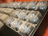
As shown in the above picture, I replaced the entire top row and the cluster of "navigation" keys on the right side of the keyboard (I have all of these keys memorized, and I rarely use the escape and function keys anyway). I really like the overall look of the keyboard now, and the transparent key caps really make the board look unique.


The key caps themselves are uncolored, i.e., they are not off-yellow, smoked, or merely translucent. They do have a little texture on the upper surface, which makes them look frosted when looking top-down.


The blue stems of the mechanical switches are visible through the transparent key caps (yes, my keyboard has Cherry blue switches). More eye candy for me = good.


I don't plan on updating this layout anytime soon. Yeah, sure. That's what I said the last time, and the time before that.