October 31, 2013

Drafting Pencils! Pentel P205, Pilot S10, and Staedtler 925-35

My FPAD (fountain pen acquisition disorder) has settled down somewhat, but I've been slowly collecting more mechanical drafting pencils to add to my quiver. I wanted to try some pencils that I've seen and read about (other than the Pentel Sharp Kerry and the Pentel Graph 1000 For Pro). I admit that I went a little overboard and, in a moment of geekness, ordered three pencils from a Japanese vendor: Pentel P205; Staedtler 925-35; and Pilot S10 (shown left to right in the following picture).

Three Of A Perfect Pair
I bought the P205 for nostalgic reasons, as this is the classic mechanical pencil that I used during high school, college, on the job, etc. It's a great design, and it works great, too. I got this pencil in the 0.5 mm size, and in a special colorway that looks like carbon fiber.

The Classic P205
I ordered the Staedtler primarily because Dave ranks it in his top ten. I had to see for myself. I opted for the navy blue version, also in the 0.5 mm size. The size is conspicuously marked on the end of the eraser cap, which is great unless you are a free spirit who likes "points up" in your pencil cup.

Staedtler 925-35
The fit and finish of the Staedtler 925-35 is really nice. The knurling at the business end is nearly perfect, and the chrome accents look great against the blue body. The pocket clip is sturdy, with a good amount of tension. The lead hardness indicator near the knurling is a nice touch (it has selections for 3H, 2H, H, F, HB, B, and 2B).

Staedtler 925-35
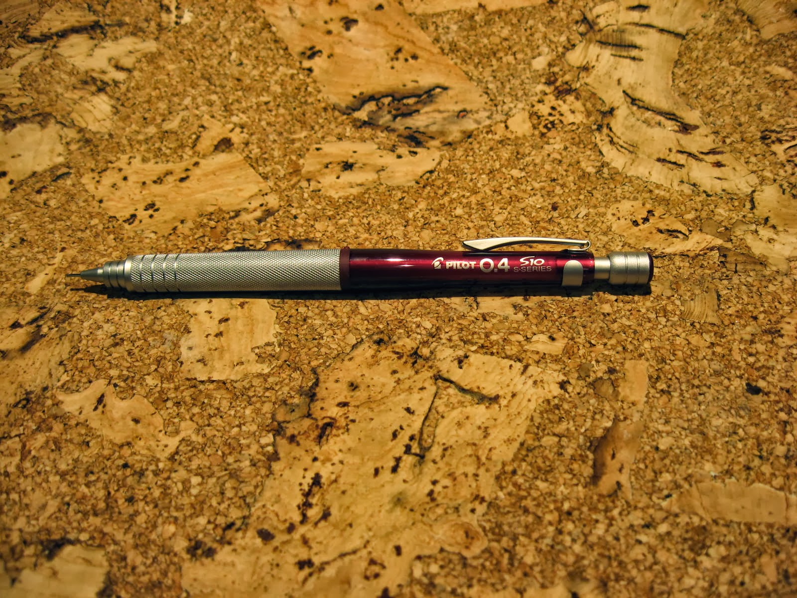
I got the Pilot S10 for its eye candy appeal, and because it also gets good reviews. Pilot's S10 line is color-coded according to the lead size. Fashion trumped function in this case, and I ordered the red translucent body (which just happened to be a 0.4 mm size). This pencil looks spectacular, worthy of prominent display in a pencil cup. There is a large grip section with fine knurling on it. It's not as grippy as the knurling on the Staedtler, but it is still effective.

Pilot Makes Good Pencils, Too
Like the Staedtler, the S10 has an obvious lead size marking on the eraser cap, as shown below. The cap also serves as the lead hardness indicator, which has selections for 2H, H, F, HB, B, and 2B. The pocket clip is sturdy and strong, and its brushed silver finish pairs well with the other accents on the S10.

Pilot S10
All three of these pencils work great. I don't use the Pentel P205 that much because I consider it to be more of a souvenir than an everyday writing instrument. The grip section of the Pilot S10 is noticeably thicker than the grip section of the Staedtler 925-35 (I don't own calipers; not that much of a dork).

S10, P205, 925-35
I do own a digital scale - the P205 weighs 9.2 grams, the S10 weighs 19.7 grams, and the 925-35 weighs 16.8 grams (all with several leads installed). I realize that the S10 may be too beefy for extended drafting or sketching sessions, but I typically only use it for short periods of time. If I had to choose only one of these to write with, it would be the Staedtler 925-35. If I had to pick one to look at, the Pilot S10 wins.

October 21, 2013

San Diego Padres Baseball Cap

I promised myself that I would publish this post before the 2013 baseball season ends. So read on . . .

I wrote about 59Fifty baseball caps a few months ago, and am still somewhat intrigued by the whole concept. Even though I'm not a huge baseball fan, I always like to root for the underdog. Accordingly, I recently acquired an official on-field cap bearing the logo of one of the suckiest teams in baseball: the San Diego Padres.


Technically, this piece of headwear should be called the New Era 59Fifty Official MLB On-Field Cap, San Diego Padres, Alternate Color (or something to that effect). The above picture shows the sticker flair that adorns the brand-new cap. I'm an old traditionalist, so I immediately removed all the stickers from the cap. I realize that some may consider this to be sacrilegious, but meh whatever. It's just a hat.


Yes, it's just a hat, but it's an OFFICIAL hat. It says so on the inner headband part. That makes it special, I guess. I like the fact that the hat isn't cluttered with New Era branding or other extraneous logos. It has the San Diego emblem on the front and the obligatory MLB "batter man" logo on the back - that logo has been around since the late 1960s (not kidding).


I like the olive color and overall look of this cap. Unfortunately, the crown doesn't fit my pin head as well as it should. I may need to hit the New Era online forums to see how best to shrink the crown a bit. LOL, there's an online forum for everything in the world these days. So awesome.

October 11, 2013

Lamy Safari/Vista Nibs

My opinion of my Lamy Vista seems to change from month to month. I was very happy with it when I first got it (read all about it right here), but I've moved on to different and better fountain pens. I bought the Vista with an extra fine nib, but I've grown to dislike it. It's scratchy, it skips quite a bit, and it's not very smooth. Fortunately, one great thing about the Lamy Vista (and Safari) is that the nibs are interchangeable, are rather inexpensive, and are available in several different varieties. For that reason alone, the Lamy is great for experimentation.

So, back to the nibs. I ditched the extra fine nib and replaced it with a fine nib. That worked slightly better, but it still performed poorly compared to most of my other fountain pens (I realize that it may not be fair to compare the Lamy to "better" pens like the Pelikan M205, the Pilot Custom Heritage 91, and the Sailor Professional Gear, but they do serve as valid reference instruments). After suffering with the fine nib for a while, I decided to try a medium nib - it was on sale and hard to resist.

Lamy Vista - Medium Nib
The medium nib writes noticeably wetter and smoother than the fine and extra fine nibs, which is nice. However, the medium still skips from time to time, especially on good paper like Rhodia. It just seems to be really finicky. The aforementioned "better" pens do not skip or stop writing like this at all, so I'm disappointed and ready to call it quits on the Lamy. Well, maybe not giving up on it or throwing it away, but I don't think I'll be buying any more nibs for it.

Lamy Steel Nibs (EF, F, M)
Here are some writing samples that I prepared using the Lamy Vista with the medium nib, on different paper types:

Lamy Medium Nib Sample 1
Lamy Medium Nib Sample 2
Lamy Medium Nib Sample 3
Sample 3 was written on Rhodia Dot Pad paper. This is where most of the skipping and stopping occurs. I guess the Lamy nib does not like to write on super smooth glass-like paper. I suppose I could make this a non-issue by only using the Lamy on "lesser" paper, but then I would have nothing to complain about. What fun is that?

I really wanted to compare all three Lamy nibs side by side, but I didn't want to try hot swapping the nibs with a converter full of ink. Instead, I decided to fabricate a dip pen using cutting edge technologies.

Dip Pen
I would like to say that this setup worked well, but it really sucked. It did, however, enable me to scribble some lines in a very unstable manner for purposes of a side-by-side comparison. The less than impressive results are shown below:


I don't even know if there is a point, take-away, or moral to this story. I guess the TL/DR version is: I've tried three steel nibs from Lamy, and have struck out. I prefer to use my other pens that don't like to hop, skip, and jump so much.